Consider Your Visual Design
All of the instructional material you design will have a visual design. If you don’t hink about or plan your visual design, it can be distracting. Materials that are primarily text have visual design elements like fonts, colors, sizes, and treatments like boldface or underlining. Graphics and videos obviously have strong elements of visual design. A distracting visual design can negatively impact learning.
An easy way to create design specifications for the Digital Ambassadors is to create and use templates. As a team, the Digital Ambassadors may want to create templates for documents, handouts, and tutorials. These can include consistent logos and branding for videos, like title and closing screens.
Some visual elements you may want to specify in your templates include:
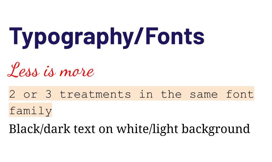
Fonts. Determine the standard typeface(s) to use. Also specify the font size that should be used for different uses: normal text and different headings.
Colors. You can start by using official school or district colors or the Digital Ambassadors may want to choose your own. Colors are expressed in different ways for different settings (for example Pantone colors, Hex codes, or RGB values). If you add your colors to your templates, you don’t need to worry about understanding those. One way to pick colors is to use an online color picker that can suggest a handful of complementary colors.
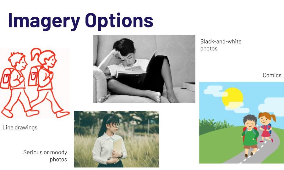
Images. You can suggest whether the Digital Ambassador learning materials should use images of real people (photos) or drawings or other types of graphics. You can store different images on a shared drive so they can be used multiple times. Be sure to follow licensing guidelines for images, and become familiar with royalty-free image sites like
- Pixabay.com
- Pexels.com
- Unsplash.com
- and others. (Note: Only use sites approved by your district.)
Don’t use too many font types and treatments.Stick with two or three different treatments within the same font family for the main text, headings, and accent fonts. Black, or dark, text on a white, or very light, background often works the best for readability. Those with visual issues will appreciate larger fonts. Selecting two complementary and one accent color can meet most design palettes.
How do these different design choices impact the instructional message?